How do we keep every patient on course, from screening to treatment to follow-up, without losing sight of the hand-offs along the way?
Our CATSystem Patient Journey Tracker turns that complex path into a clear, scrollable timeline you can understand at a glance.
At GHI, our work with the CATSystem (Cancer Tracking System) has produced a visual patient journey map that traces the entire care continuum, from screening and diagnosis to treatment, referrals, and follow-up, while highlighting the critical points where patients are most at risk of falling through the cracks. This is the real essence of a tracking system: not merely recording events, but revealing the relationships between them so that action becomes obvious.
About the tracker
What we’ve built is a longitudinal, patient-level timeline that replaces scattered notes and siloed registers with a single, readable story. Each graphic aligns four layers of information across time. Referrals sit above the line, making inter-facility transitions unmistakable. The center of the timeline carries the cadence of care, dated encounters with a clear label for the visit, paired with a concise diagnostic highlight that gives just enough clinical context to anchor interpretation. Below, a risk lane surfaces adherence issues such as late or missed appointments. Between these layers, dashed connectors draw a line from intended follow-up to the actual encounter, so the gap between plan and reality isn’t buried in a database field; it’s right there on the canvas.
Why this matters
In many programs, a patient’s story lives in multiple places: clinic registers, lab systems, referral notes, messages, etc. The Patient Journey Tracker pulls those threads together so teams can answer three essential questions instantly:
- 1. What happened? (Encounters and diagnoses over time)
- 2. Where did the patient move? (Referrals in and out)
- 3. Where are the risks? (Missed/late appointments and delayed follow-ups)
Spend time with a few trajectories and patterns emerge:
The “clean arc”: Some journeys read like a smooth arc: screening leads to treatment; follow-up occurs on schedule; the dashed segments stay short; the path cruises toward discharge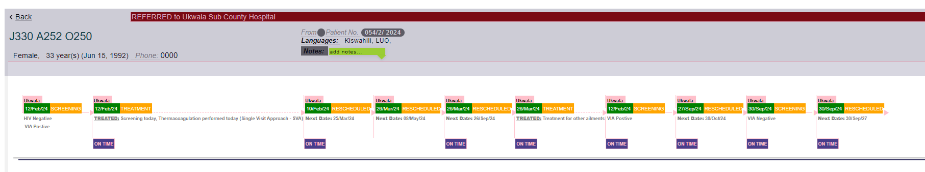 .
.
The “detour and return”: Others show a deliberate detour, a referral outward for specialized care, followed by a return to the original facility, where the tracker lets you visually close the loop.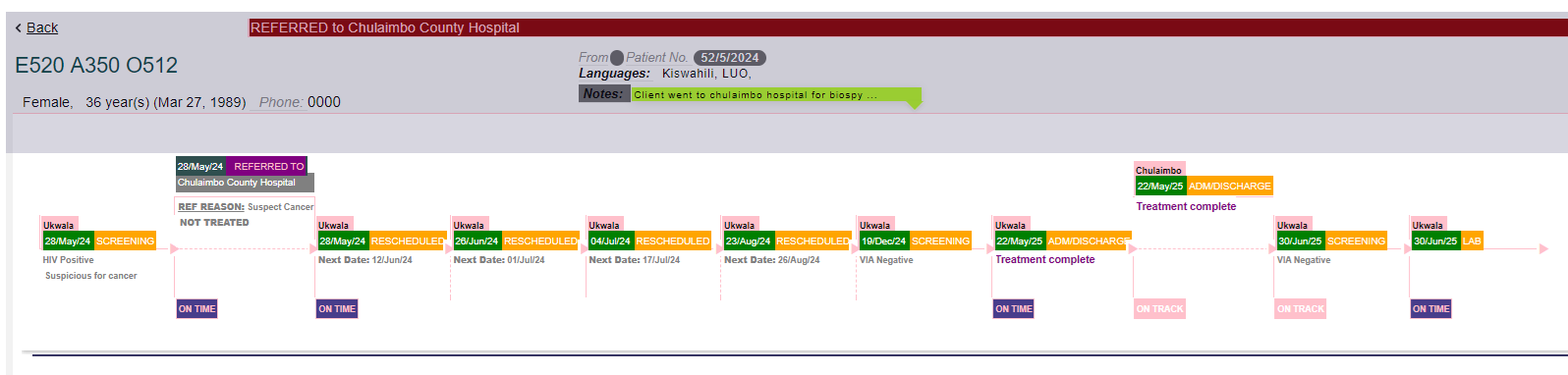
The “at-risk gaps”: And then there are the inflection points we care about most: a stretched dashed connector paired with a marker in the risk lane, signaling an appointment that didn’t happen when it should have. Those are the hazard windows for loss to follow-up. When they’re visible, they’re actionable, either by means of an SMS prompt, a phone call, or a community visit.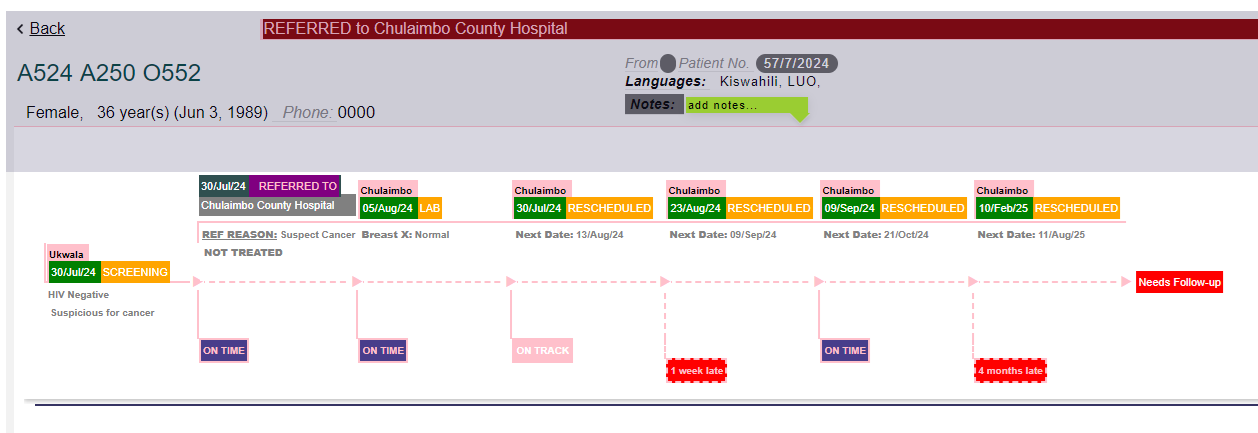
What this enables for teams
The value is not only aesthetic. Under the hood, the tracker unifies encounter data, selected diagnoses, referral endpoints, and appointment schedules into an aligned timeline. In research terms, it’s a time-aligned, patient-level trajectory that makes adherence signals and time-to-event gaps legible.
In implementation terms, it’s a shared situational picture where clinicians can see clinical context at a glance, program managers can see process reliability (where follow-ups slip, where referrals stall), and outreach teams can see precisely who needs re-engagement now. The charts can also be used in case reviews, reports, trainings, and stakeholder updates.
For teams, it means:
- 1. Faster huddles & case reviews: Open a tracker and everyone’s on the same page within seconds.
- 2. Smarter referrals: See whether referred patients were seen on time and where the loop closed.
- 3. Targeted re-engagement: Late/missed appointments are obvious, so staff can prioritize outreach.
- 4. Program insight: At scale, patterns in dashed connectors and pitfalls reveal where systems need strengthening (e.g., lab result follow-ups, inter-facility transfers, or appointment spacing).
So, what changes when you can see the whole story? Huddles move faster. Conversations shift from “What happened?” to “What should we do next?” A cluster of broken or elongated connectors after a particular diagnosis might suggest we need to strengthen lab result workflows. A series of late visits following referrals may point to friction in hand-offs or transportation barriers. Over time, these visuals become a quality-improvement tool. As SMS reminders and teams actions and better scheduling are put in place, the gaps begin to reduce. Therefore, the diagram doesn’t just record events, it helps drive the system toward reliability.
Designed for Clarity, Practicality, and Reuse
We designed the tracker to travel well. Inside CATSystem, it’s a scrollable view you can hover-on for tool tips and click-through to open precise forms, during routine reviews. As a static image, it slots neatly into reports and presentations to illustrate continuity of care without exposing personal information. And because the language of the diagram is consistent (referrals above, encounters and diagnoses in the middle, pitfalls below), teams build fluency quickly. The diagram becomes a shared grammar for continuity.
